
A few years ago I binge watched the docuseries, The Lost Kitchen on HBO and fell head over heels for the rustic restaurant set in an old grist mill in Maine. I am now an avid Erin French fan and would love to make the trek to Freedom someday to dine in the restaurant. If you haven’t yet seen the series, run don’t walk! It is pure comfort. Of course, I instantly wanted to uproot my life to live in an old mill and cook cozy meals. As I often do with movies or shows I am inspired by, I found myself taking photos of my TV and then obsessively looking for images online after. There was just something about all of the details in her open kitchen space. From the beautiful fresh florals to the cookware on display – it instantly gave me all the feels.
I find one of my biggest sources of inspiration for residential kitchen design is not always other homes, but restaurants. With certain spaces there is this beautiful layering of materials that happen and since functionality is of the utmost importance to a commercial kitchen, I like to pay attention to everything from layout to design elements that we often don’t think of. I am really drawn to more intimate small scale kitchens where it is extended into the dining room. This can demonstrate how the seamless flow creates that overall lived in mood we are trying to achieve in our own living spaces.
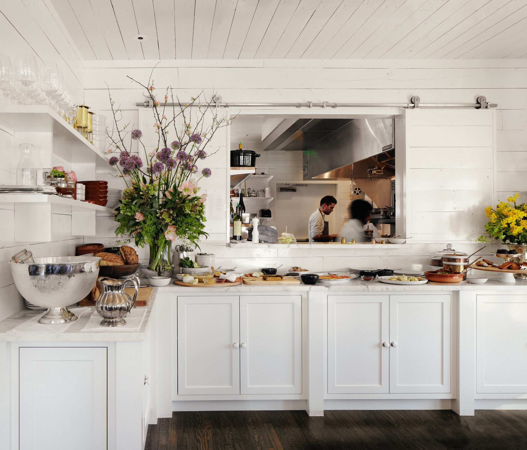
Josephine House in Austin, Texas. Beautiful simplicity is the theme throughout all of these spaces. Classic cabinetry with panel detailing on the walls and ceilings add interest to an all white space. I love the contrast with the dark stained hardwood floors and mix of finishes with silver and copper.


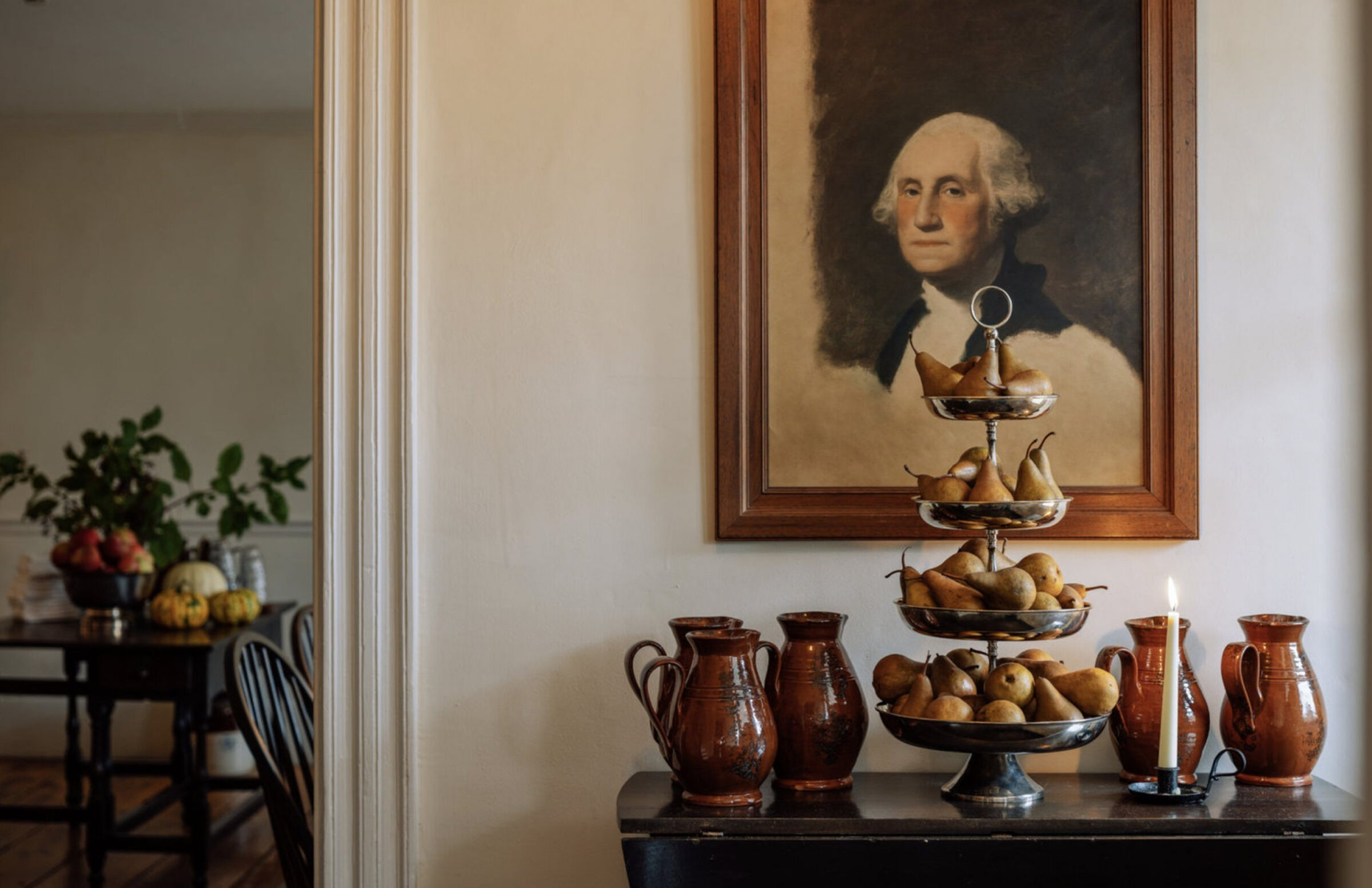

Stissing House in the Hudson Valley is at the top of my list to visit. Similar to The Lost Kitchen, this cozy, rustic space looks like stepping back in time. I have saved so many images of the kitchen with the dark countertops, exposed wood burning oven and pretty open shelving. This is an example of no simple detail spared throughout. All of the vessels for florals and branches, vintage furniture and charming artwork make this feel more like a charming home than a restaurant.
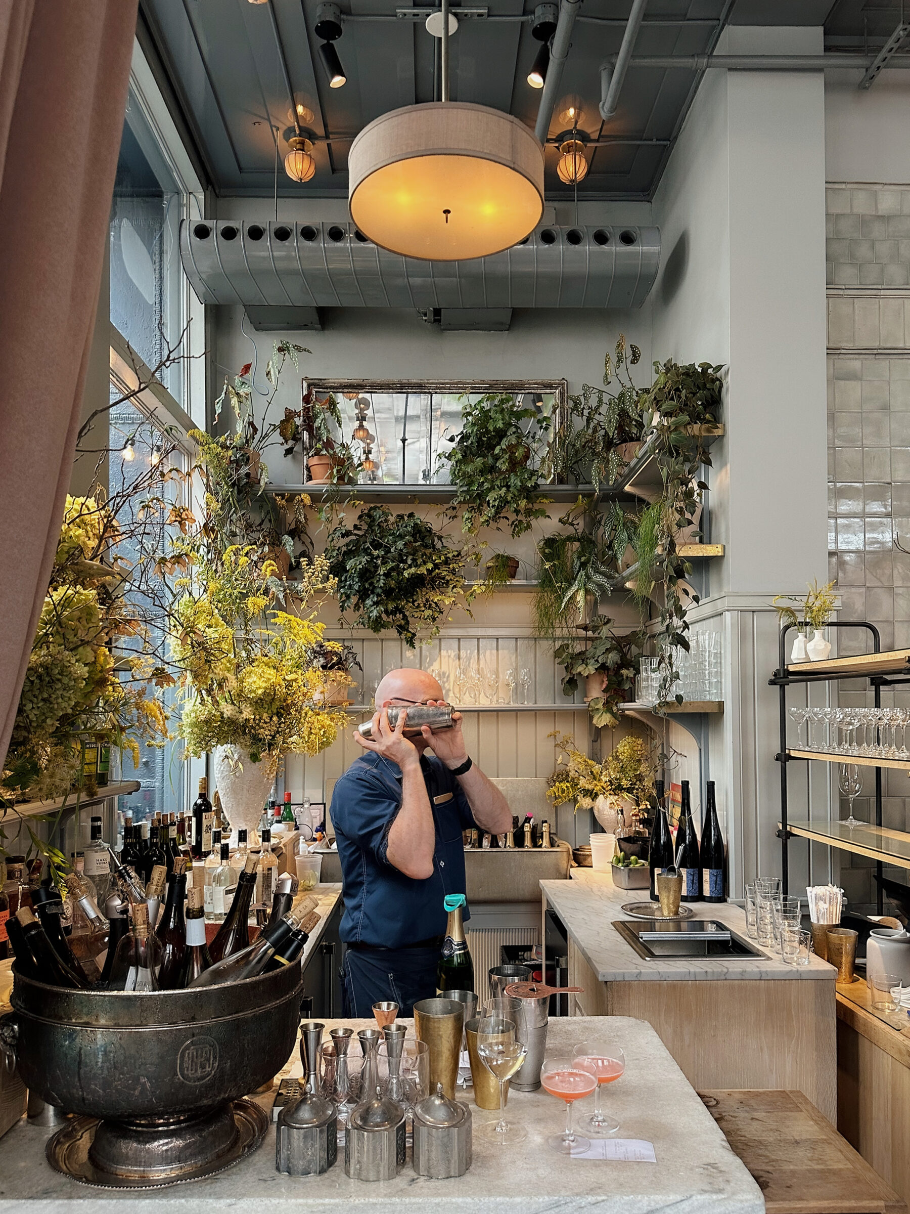
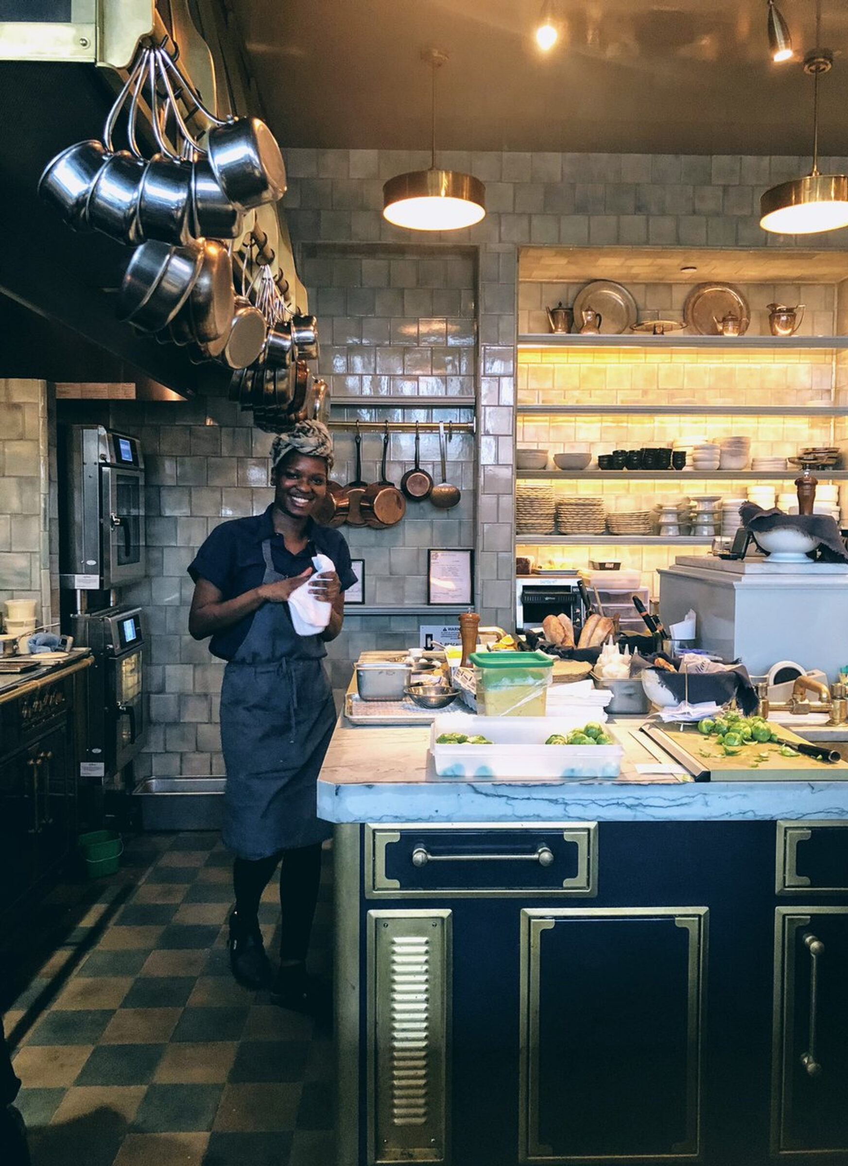


La Mercerie designed by Roman & Williams in NYC is one of my favorite spaces for inspiration because it is so incredibly layered and detailed. The first time I walked into this space I didn’t even know what to take in first. The different tiles, the lit alcoves to display dishes and mix of materials is so interesting. I also love how open the kitchen space is to the dining area so you can see the stunning checkered floor, French cooktops and display of functional serving dishes and pots. You can see so many of these charming layered details that add so much interest translated into the personal kitchen of the designers behind Roman & Williams – Stephen Alesch and Robin Standefer (last two photos).
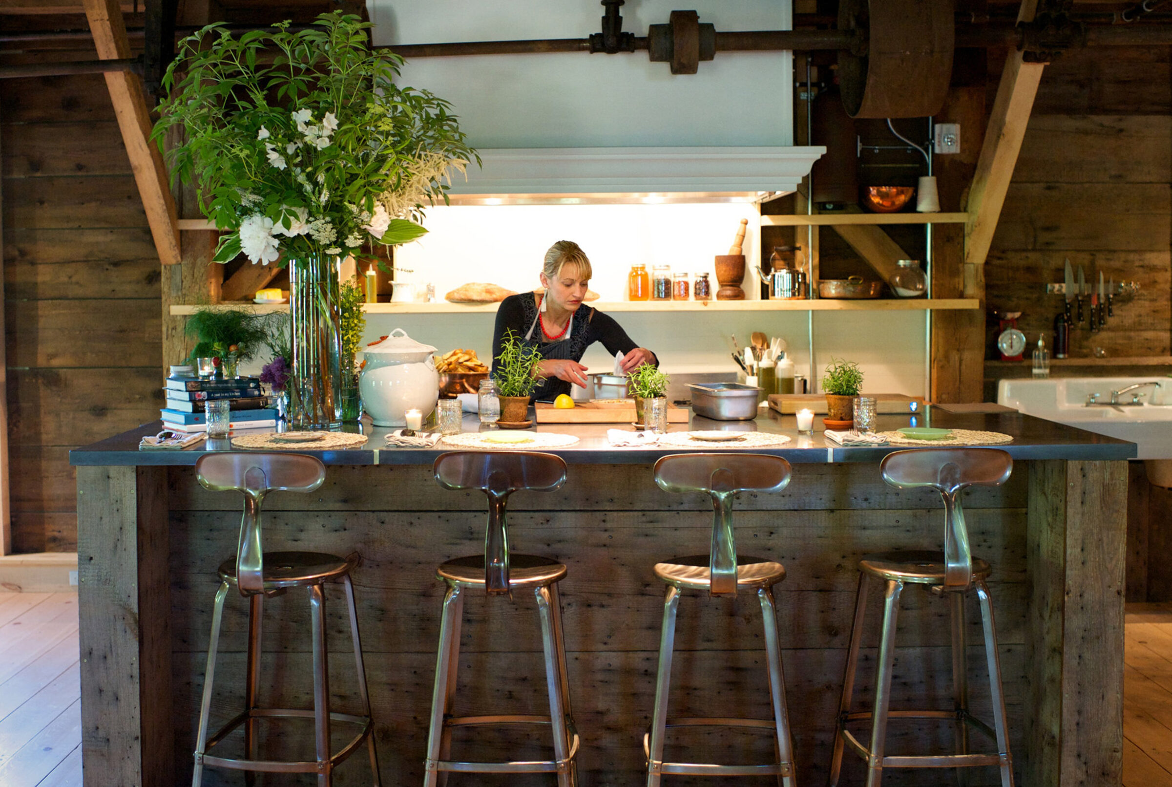
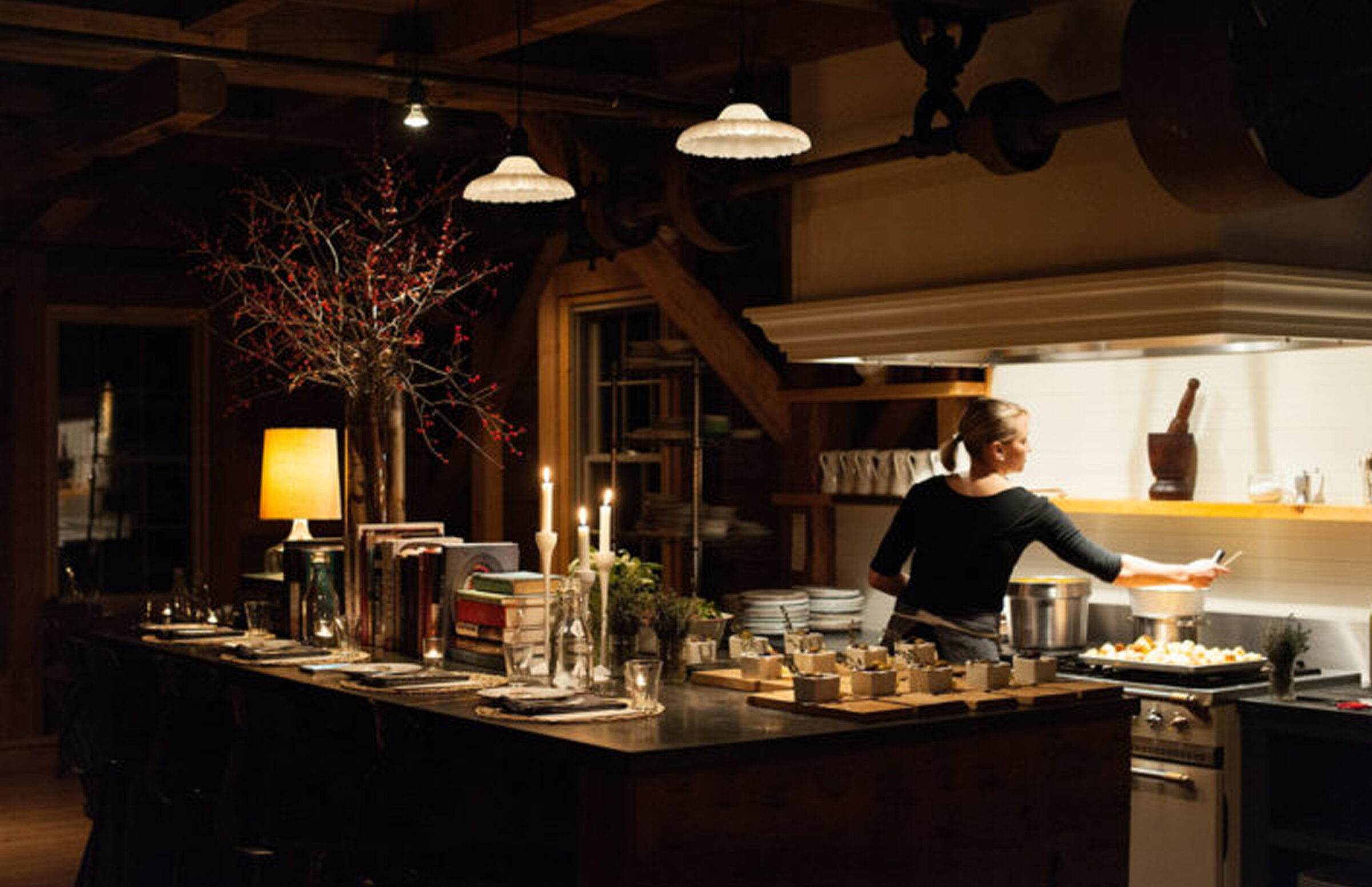

I really just want to sit at the island in The Lost Kitchen and eat a meal on a crisp fall night. The varying wood tones, large Lacanche stove and different Staub dutch ovens makes this feel like you are eating in Erin’s personal kitchen and not a restaurant. It just looks so warm and inviting!
Great post. Wonderful kitchens!!!
Thank you!
Thank you so much Cindy!!
I’m equally as enamored with the Lost Kitchen! Such a lovely show, visually. It’s embarrassing how often I Google images of the cafe set from It’s Complicated and wish it was a real place.
It is just so charming!! I totally do the same thing – I could hangout there all day!!
I love this! All these spaces are so beautiful. I’m glad I’m not the only one who takes pictures of my tv screen, lol.
Haha it is so hard not to when you are instantly inspired!!