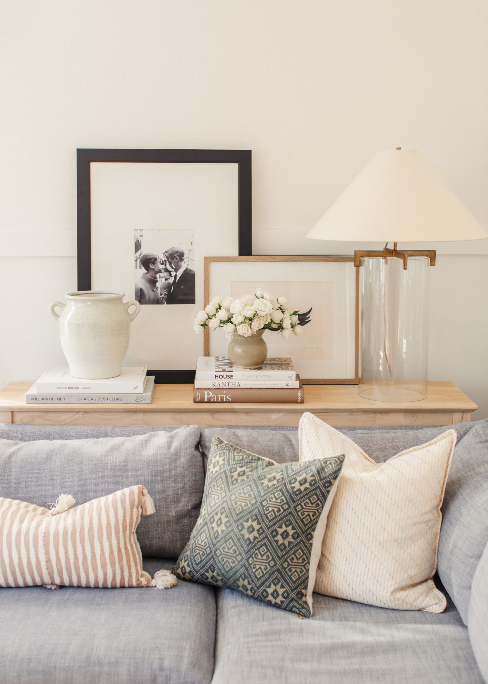
Have you ever looked at a photo of a room or been in a space that just feels right? Beyond the individual elements the over all feel just emits a vibe that instantly gives you pause. I have found what often creates that is scale and proportion. I have talked a lot about the importance of scale in design, but considering scale and proportion are both key fundamentals of design I figured I would elaborate on it more.
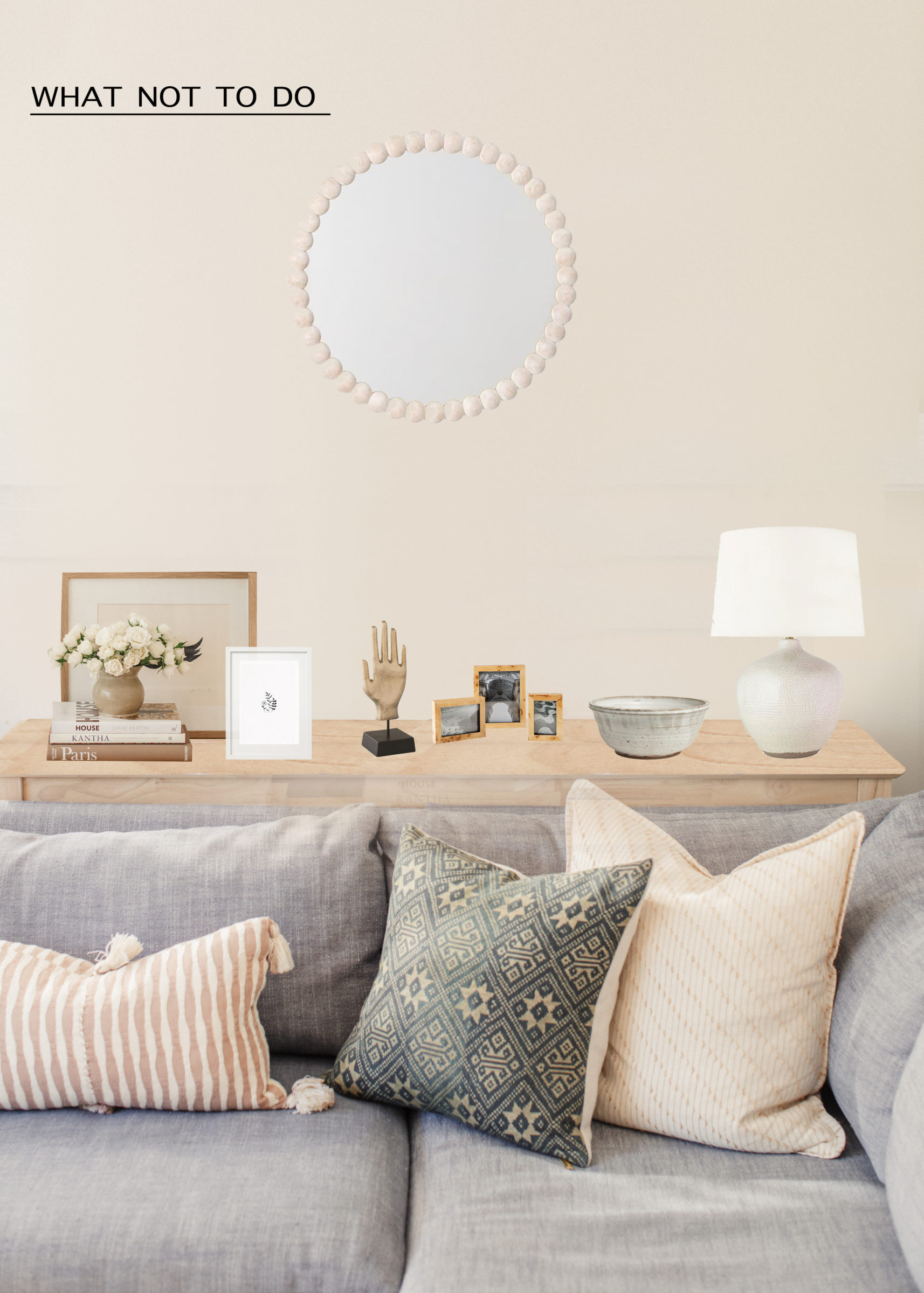
I get asked so many questions on ways to style – a console, a bookshelf, a dresser. However in order to get a better handle on styling it is crucial you understand the importance of scale. For a lot of people this is intuitive and done by feeling. If that is not the case for you there are some ways you can develop that skill. The mock up above shows a poor use of scale because no visual balance is really being achieved. I see this all the time – a surface is covered in a lot of objects similar in size without any good layering elements or anchor points. Instead of looking puled together it looks flat, cluttered and overall can make the room feel smaller. I really think the key to having a pulled together room is using less than you think you need, but really paying attention to the size of what you are using.
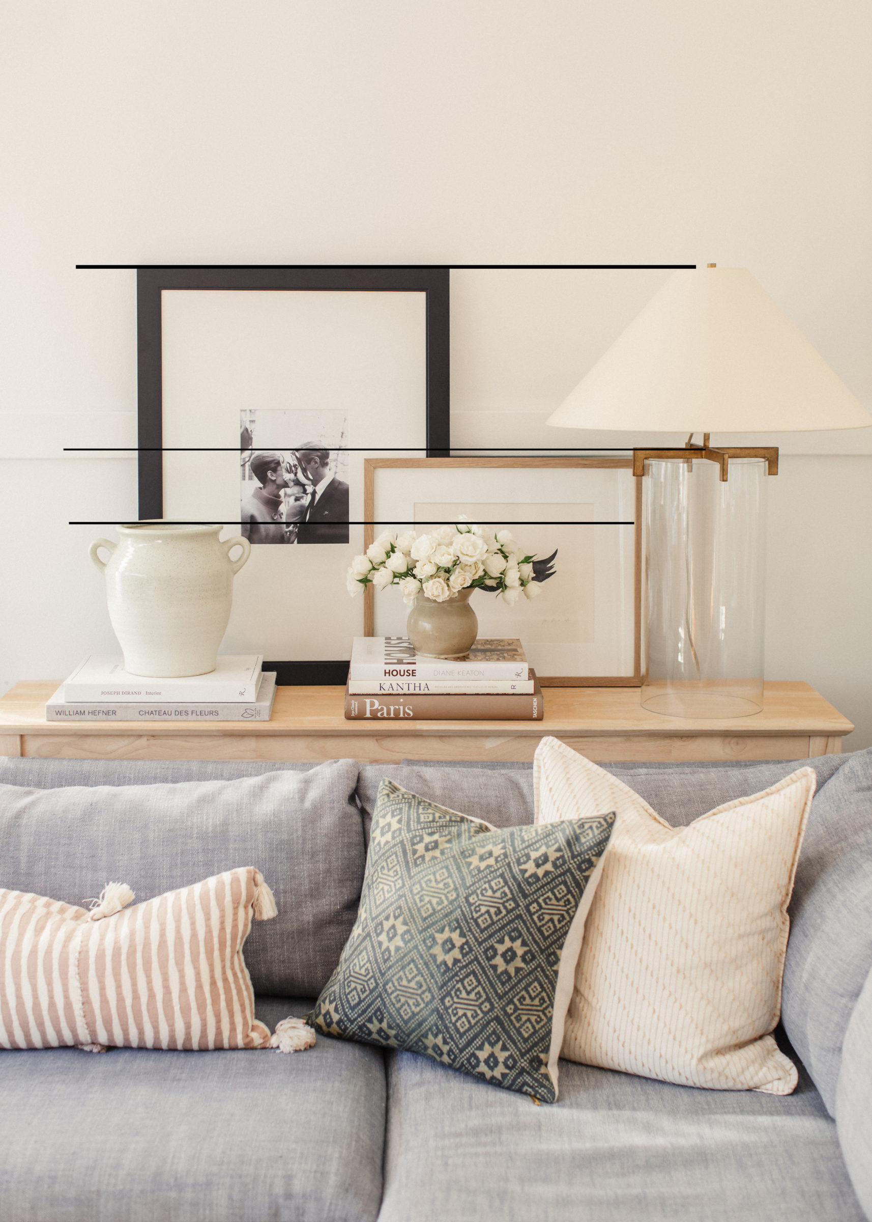
Scale goes hand in hand with proportion. You could have a larger piece, but as long as it is proportionate to the surroundings it will strike that visual balance you are looking for. For instance, take my console set up. I started with the lamp which is tall with a substantial shade. From there I pull a visual line of reference over to something similar in proportion which is the black frame. These are creating visual anchor points that pull the entire vignette together. Then, generally working in thirds a middle layer is created with the frame and another layer with the vases and book stacks. The books serve as key layering components that add height, varying color and texture. Books often get lost on a surface so it is important to choose heavier books that take up a lot of space.
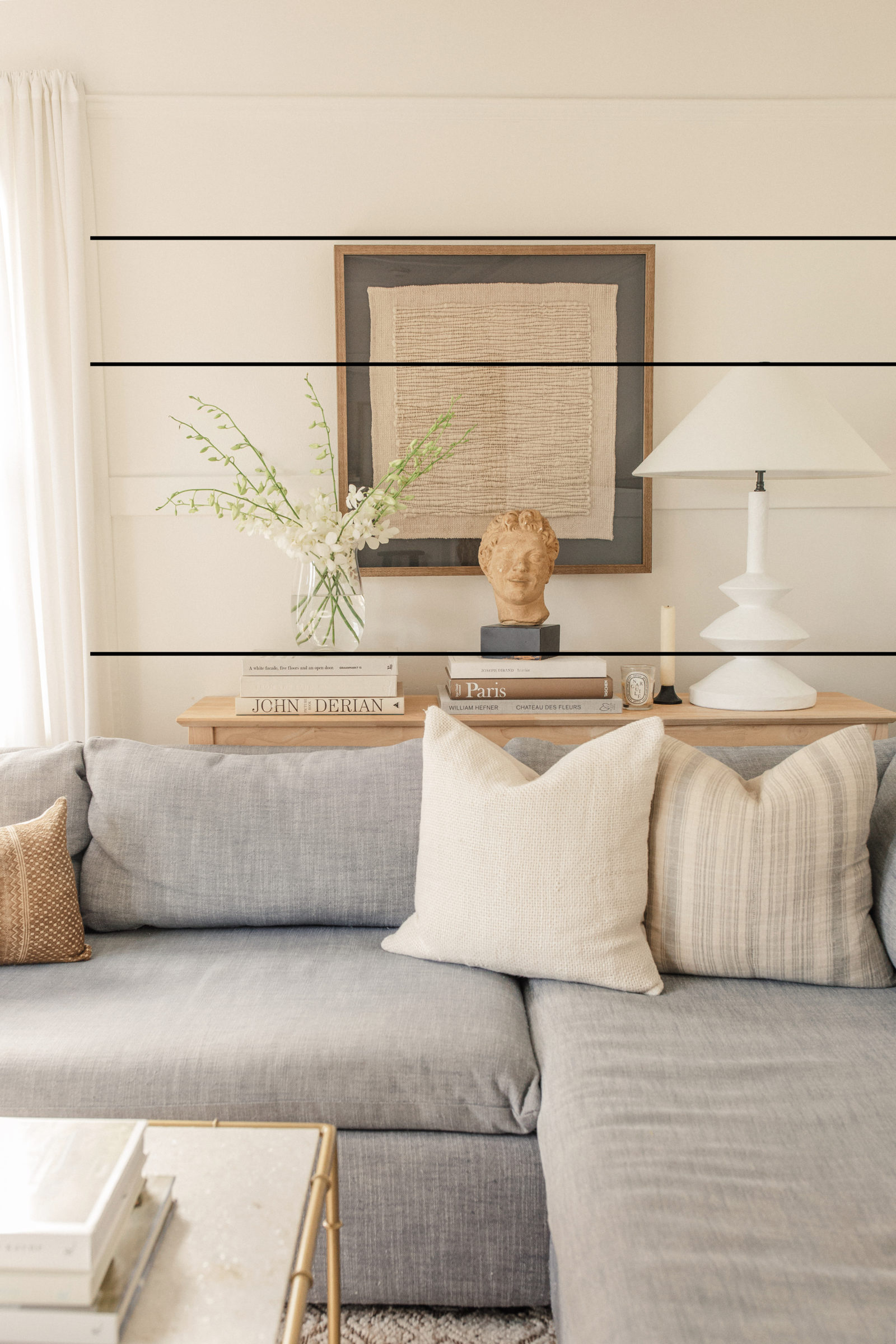
Even when I changed this area up and added art to the wall, I made sure the lamp was just as substantial to fill that corner nicely. The top of the flowers fall in line with the top of the lamp, and the top of the books fall in line with the first layer of the lamp. These are the visual reference points that when you step back make something feel incredibly cohesive and effortless.
You can and should apply these principles to every aspect of your space, not just console styling. Your area rug needs to be proportionate to the room and the furniture you have laid out. Some people are masters of blending in out of scale pieces like art and furniture. Axel Vervoordt is a genius when it comes to this, but most of us aren’t dealing with the spaces he is and don’t have that talent, so I find it works best to keep it simple and stick to the fundamentals.

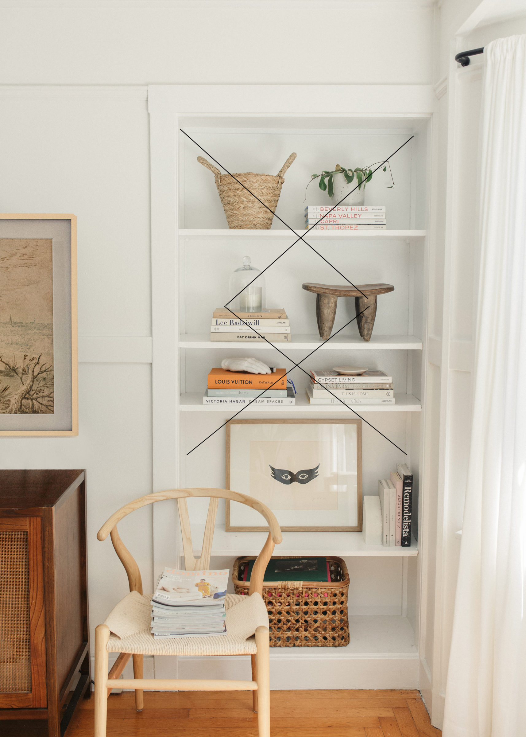
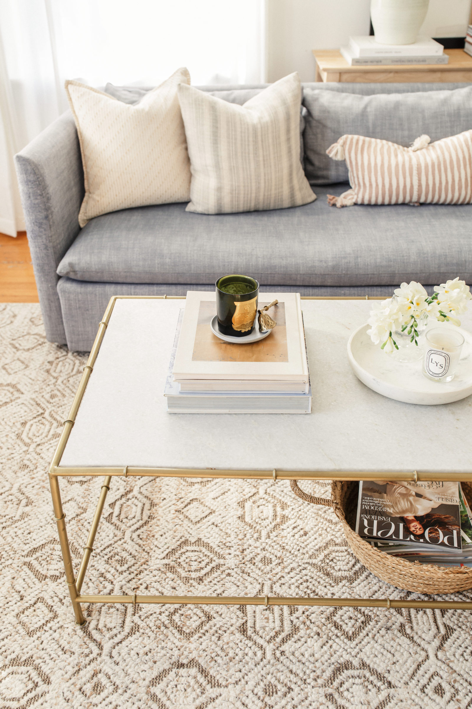
For bookshelves or a coffee table I like to work in stacks that play off of each other size wise, but introduce different materials to help visually stimulate. I tend to work in diagonal patterns on shelves to create a flow that reads well from top to bottom. Styling and gaining a better understanding of scale takes practice and is fun to play around with. As I always say, when working with a new space I recommend taking everything off of the table or shelves and start with a clean surface. It can often be easier to start with a blank slate instead of trying to rework something piece by piece!
Beautiful home! Where did you get your lovely sofa?
Thank you Lauren! It is from West Elm and linked on My Apartment shop page.
This is beautiful and very helpful. Do you interior design for clients?
Thank you so much Abby! I do, there are more details about it on the Studio tab of my website. Xx
[…] IMAGE CREDITS: Top Left: Ashley Kane, Top Right: My Instagram, Bottom Left: Dreams & Jeans, Bottom Right: Harlowe James […]
I love the whole console look! I’m wondering what the dimensions are of the two frames. I want to display two frames but I’m wondering what’s a good size ratio.
Thank you so much Lupe! I belive the larger one is 22 x 28 and the smaller one is 14 x 20.
This is so helpful. Thank you for sharing!
Thank you so much Robyn!
Love your house and tips.
Thank you for sharing Chrissy.
Sincerely,
Ebonee
Thank you so much Ebonee!!
this is so helpful! thank you for sharing!
Thank you so much Maggie!!
Thank you for the post! Helps so much when it comes to styling. Where did you get the Breakfast at Tiffany’s picture? I love it!
Thank you so much Ashely! I got it on a trip to Paris with a slew of other black and white artwork, but I am sure there is a similar one online!
Thank you for this post! I must’ve read it 20 times already trying to learn and apply it to every corner of our house 😍
Ah I love that – thank you so much!! It truly works with every space and you will notice a difference!
I definitely see the difference! This was very helpful!! I’m about to go change up my dresser.
Thank you Nataly! I am so glad – good luck with your dresser!
This is so helpful, thank you!!
When you choose your books, do you choose them based on the color or “look” of the cover or choose them based on content and topics that interest you?
Thank you Tawny!! Definitely based on the contents so they don’t always work color wise which is ok. The only one I usually wont get is a red book because I have a weird aversion to them. ha!